The medical rationale behind this campaign may have been a little watered down.
Is this the Most Ambitious Crossover Event in History?
No. But it is a bottled water seller and a proprietary colour space system coming together to talk about pee.
Scottish brand Highland Spring and Pantone, together with nutritionist Lily Soutter, have revealed their “Pee Healthy” colour chart just in time for what is predicted to be the country’s hottest summer for a decade (stand by for more of those 24C scorchers, fellas).
Unaccustomed as Brits are to heat-induced dehydration, the campaign will encourage them to examine their urine and see whether it’s more like a “Highland Spring in Your Step” neutral (good!) or a “Dry Spell” orange (bad – reach for your favourite brand of bottled water!).

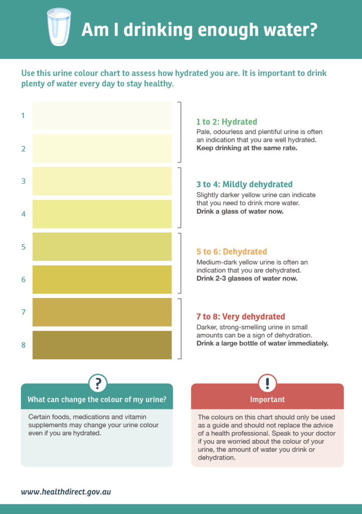
As they apparently also lack access to other more widely available charts, like this one …

… or indeed the built-in indicator of thirst, the colour chips will no doubt, as the PR copy says, “kickstart a UK-wide conversation amongst Brits to embrace our bodies’ natural health indicators on hydration, by checking the colour of our pee!”
We suppose the charts will adorn gents’ and ladies’ rooms in pubs across the United Kingdom, or be made into a handy pocket version – the press release does not say.
The chart coincides with “The Natural 10 Challenge” campaign, in which people aim to drink what the marketing says is the daily recommended 2-2.5L water.
It’s brushing over the fact that the European Food Safety Authority’s recommendation includes water from food – it’s not saying each human should chug this amount of liquid H2O every day. Although, and there’s a nice symmetry in this, you’ll certainly produce a lot of pee if you do.
Side note: In the great tradition of such products, Highland Springs is in fact bottled in the not-at-all-high lands of Perth and Kinross.
If you see something stupid, give us a tinkle at felicity@medicalrepublic.com.au.


